Changelog
appearance
Hiding navigation options
Now authors will be able to hide default navigation options in trainings. Thanks to this update authors are able to hide the linear navigation buttons and the sidebar menu. You can find out more about alternative navigation options we introduced in this changelog.
In the training overview, you can now find a new “Navigation settings” category in the appearance menu (wand icon in the right sidebar). Under this category you will have two new toggles to adjust the navigation options of your training.
Hiding the linear navigation will disable the navigation buttons, which are found by default in the lower right corner on cards within a training. For authors, the buttons will appear greyed out, but for learners, they won’t be visible at all.

Hiding the sidebar navigation will disable the overview on the left, which you can open to navigate to specific cards within the training. The default text is displayed in the following image, but authors can also use the “Text placeholder Management” menu to change the text that is displayed when the sidebar navigation is hidden.

You can find the “Text placeholder Management” menu in the Administration category of the LXT settings (accessible from the top menu).
Thanks to this new feature, you can now combine it with the alternative navigation options to create a specific or even alternating order for your training that learners must follow.
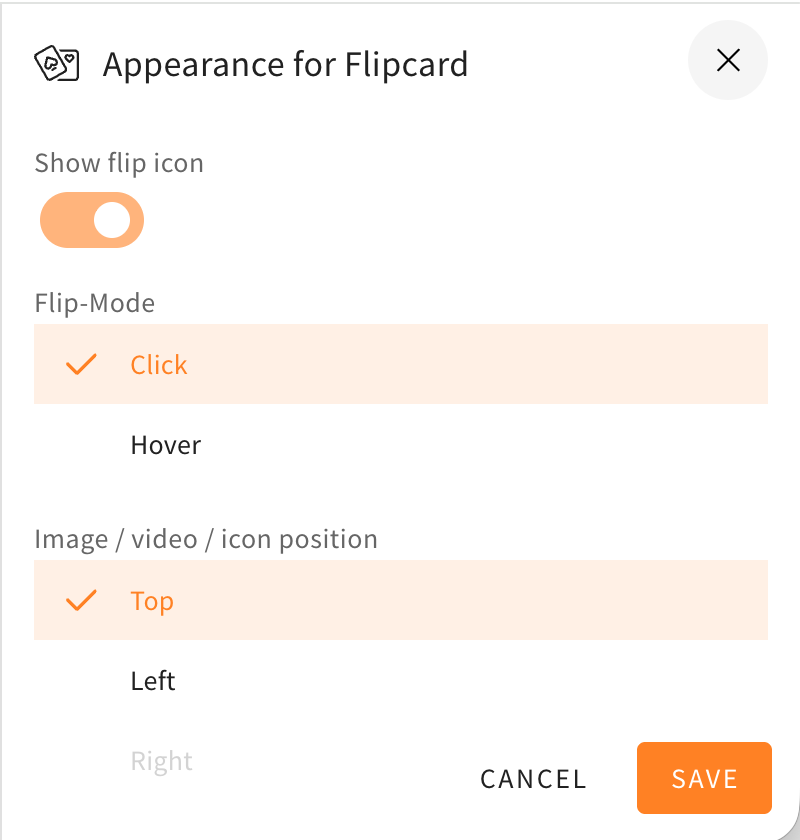
Appearance menu redesign
The style settings drawer, in which you can choose to change the appearance of different elements, rows, and others, got a redesign. The redesign will help to make the menu look more structured and orderly, because the toggles are now better grouped together and the UI is more compact. The style settings drawer will also now be colored and match the element/row actions at the corners of the elements or rows.
Here as an example you can see the style settings drawer of a flipcard before and after the changes described in this changelog.