Changelog
LXT Authoring
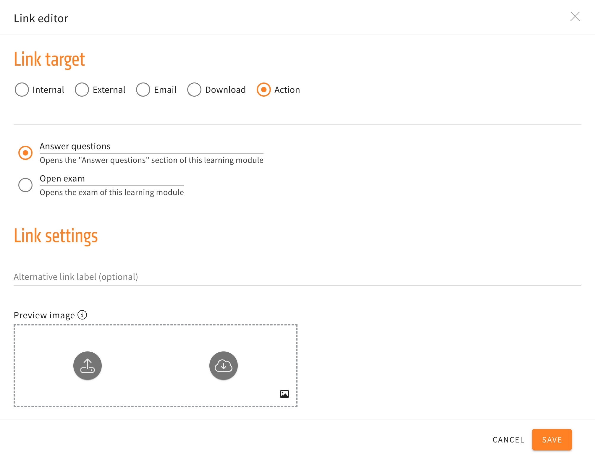
Alternative navigation in the link element
Three new options for actions are now available in the link element. The new actions will navigate the user to the introduction, the previous, or next card without having to use the buttons at the end of a card.
When creating and then editing a link element, the submenu for actions will no longer just have the options to directly open the “Answer questions” section or open the exam directly, but additionally have the three new navigation options mentioned above.
Improved Text placeholder Management
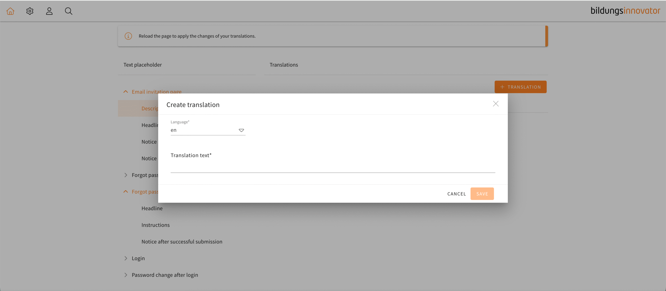
The text placeholder management is used to replace the texts which LXT can give out in response to different actions of the user, like logging in or forgetting your password. Using this menu, custom messages can be displayed instead of the default ones.
The menu for creating a translation in the text placeholder management has been changed to be more intuitive. Tooltips will now guide you through the process of creating a translation as well as be a reference point for users when writing their own translations. Once you have chosen a language, a tooltip will show the default text which you can immediately copy into your text field by clicking the “paste” button.
In the default text you will see examples of the appropriate placeholders which you can now easily copy and use. Also, a dropdown menu for placeholders has been added to the text editor similar to the one in a usual text element.
Those tools in combination with the tooltips are there to help the user navigate the text placeholder management in a more seamless way.
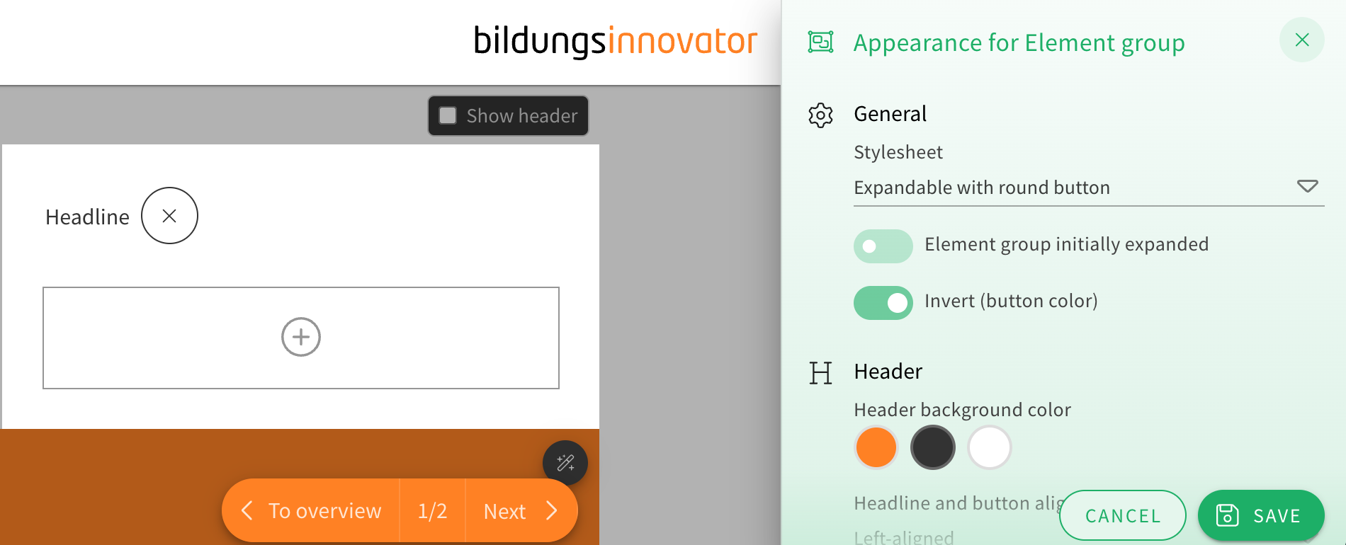
Additional options for an element group stylesheet
When choosing the appearance of an element group, the stylesheet “Expandable with round button” now offers two additional customization options.
You can now toggle drop shadows on or off and choose how rounded the corners of the element group look from a dropdown menu.
This gives the element group’s already extensive appearance options even more flexibility for authors.