Changelog
Changes for authors
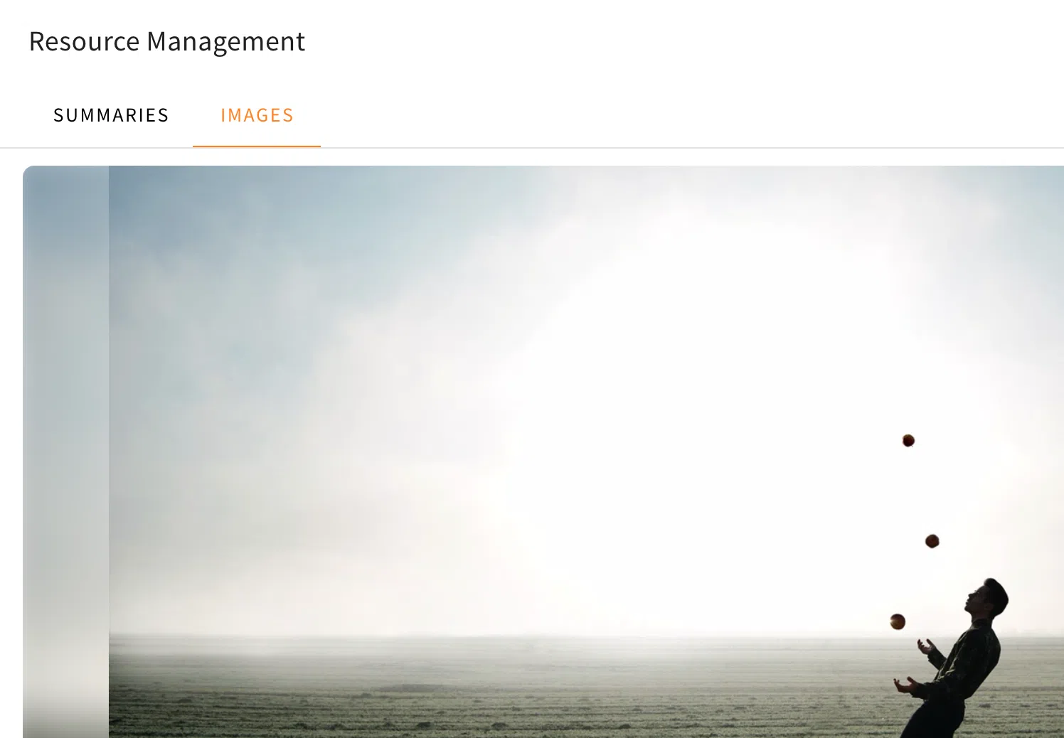
Downloading images in Resource Management
Users with access to the Resource Management menu will now be able to download images found in the images category of said menu. This way, specific images can easily be downloaded to be placed individually at another spot inside a training. This new addition gives the Resource Management the ability to better filter and reuse the images found in the file you had processed.
The download button can be found inside the image you wish to download at the top, once you navigate through the Resource Management, which can be opened in the sidebar on the right. Once you are inside the Resource Management and have used a file which was processed, you have to change the category at the top from “Summaries” to “Images”. Once you zoom in on a picture you wish to download, it will open the individual image you have chosen at the center of the menu. Here you will be able to see the download button at the top edge inside the image.
Hiding navigation options
Now authors will be able to hide default navigation options in trainings. Thanks to this update authors are able to hide the linear navigation buttons and the sidebar menu. You can find out more about alternative navigation options we introduced in this changelog.
In the training overview, you can now find a new “Navigation settings” category in the appearance menu (wand icon in the right sidebar). Under this category you will have two new toggles to adjust the navigation options of your training.
Hiding the linear navigation will disable the navigation buttons, which are found by default in the lower right corner on cards within a training. For authors, the buttons will appear greyed out, but for learners, they won’t be visible at all.

Hiding the sidebar navigation will disable the overview on the left, which you can open to navigate to specific cards within the training. The default text is displayed in the following image, but authors can also use the “Text placeholder Management” menu to change the text that is displayed when the sidebar navigation is hidden.

You can find the “Text placeholder Management” menu in the Administration category of the LXT settings (accessible from the top menu).
Thanks to this new feature, you can now combine it with the alternative navigation options to create a specific or even alternating order for your training that learners must follow.
Additional AI markers
Additional options for the use of AI markers are being added.
More elements will now have the option to toggle an AI marker, which some elements already had as described in the other changelog about adding AI markers in general and the improvement of the toggle.
The following elements now have the AI marker toggle added:
- Chatbot
- Stage
- Interactive simulation
- Slideshow
- Background Switcher
- Flipcard
- Image comparison
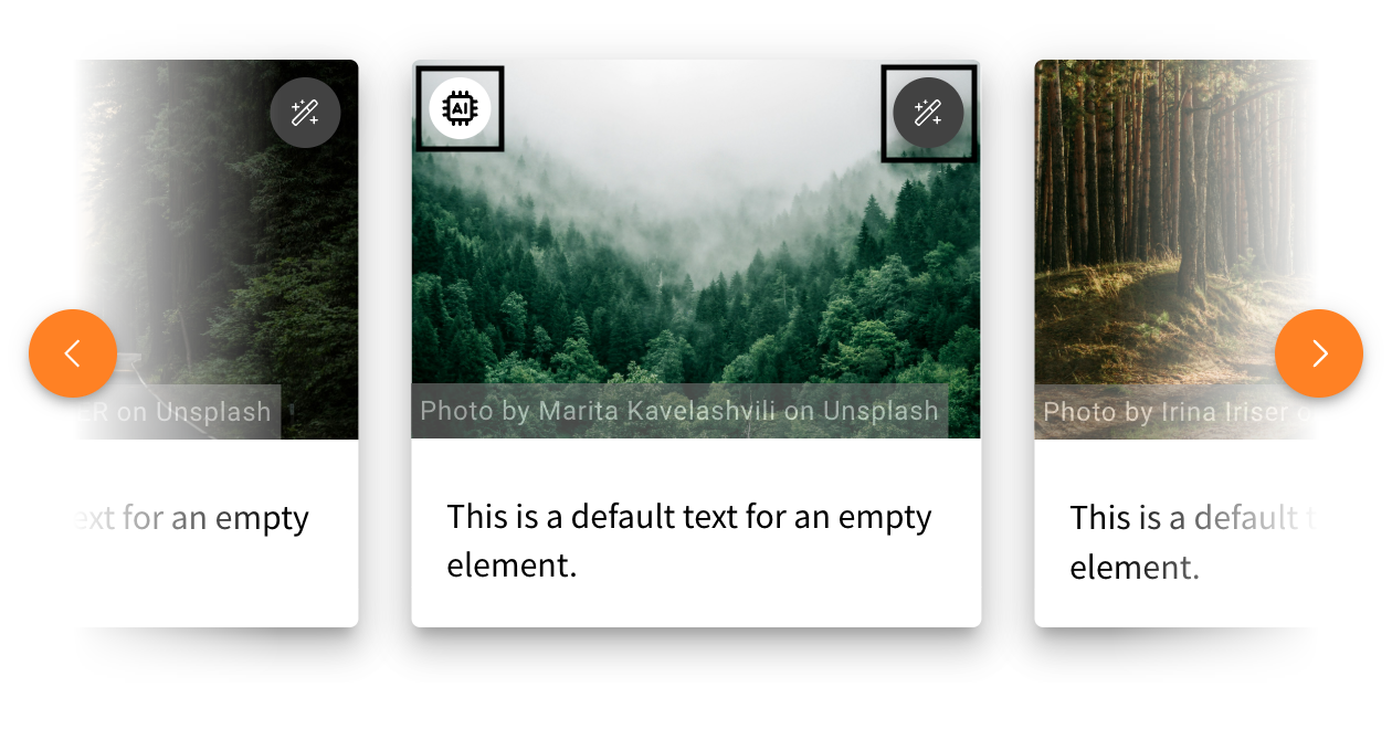
The Slideshow, Background Switcher, and Flipcard will have a marker for each slide, which also adds the StyleSettings button to each slide. In the following example, you can see what the AI marker looks like when you add it to one picture in the slideshow and where you can find the menu to add it for each slide separately.
The Image Comparison will also have the toggle option to choose which image was created with the help of AI. This way, you can add the marker to the left or right image individually or add the marker to both.
In addition, background images of a row also have an AI marker toggle, as well as images used as a preview of cards.