Changelog
Changes for authors
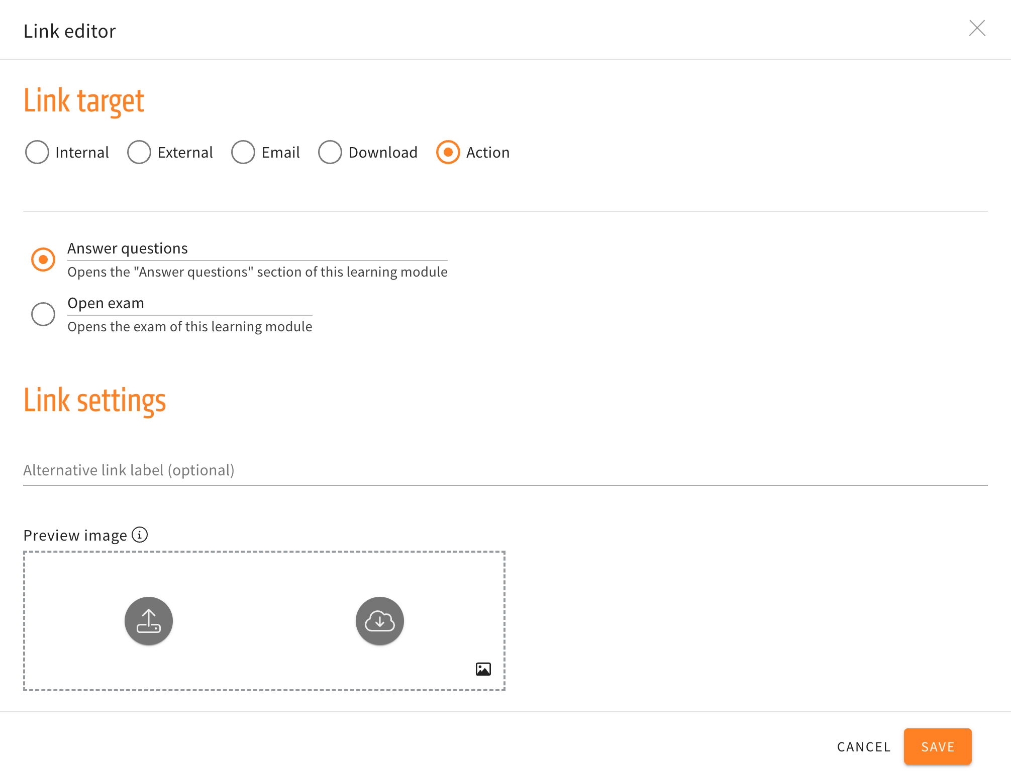
Alternative navigation in the link element
Three new options for actions are now available in the link element. The new actions will navigate the user to the introduction, the previous, or next card without having to use the buttons at the end of a card.
When creating and then editing a link element, the submenu for actions will no longer just have the options to directly open the “Answer questions” section or open the exam directly, but additionally have the three new navigation options mentioned above.
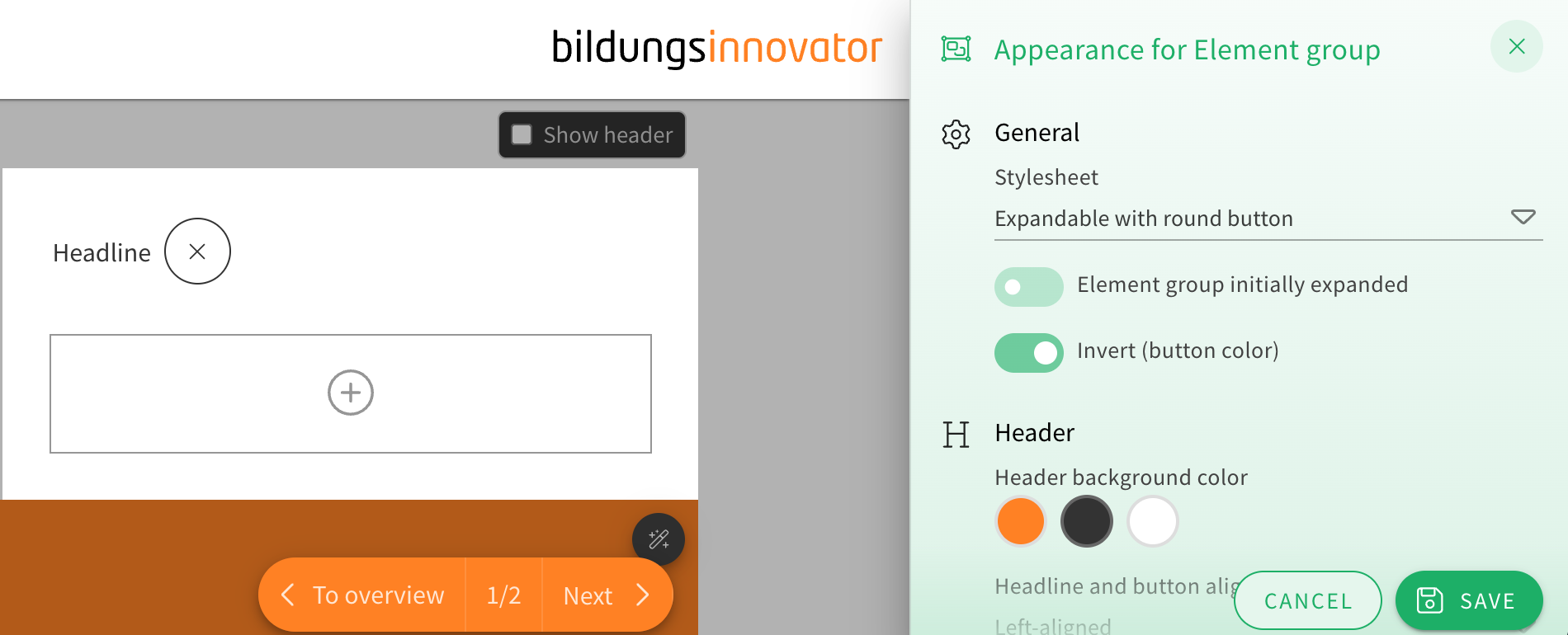
Additional options for an element group stylesheet
When choosing the appearance of an element group, the stylesheet “Expandable with round button” now offers two additional customization options.
You can now toggle drop shadows on or off and choose how rounded the corners of the element group look from a dropdown menu.
This gives the element group’s already extensive appearance options even more flexibility for authors.
Appearance menu redesign
The style settings drawer, in which you can choose to change the appearance of different elements, rows, and others, got a redesign. The redesign will help to make the menu look more structured and orderly, because the toggles are now better grouped together and the UI is more compact. The style settings drawer will also now be colored and match the element/row actions at the corners of the elements or rows.
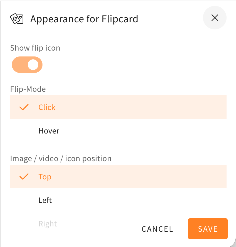
Here as an example you can see the style settings drawer of a flipcard before and after the changes described in this changelog.