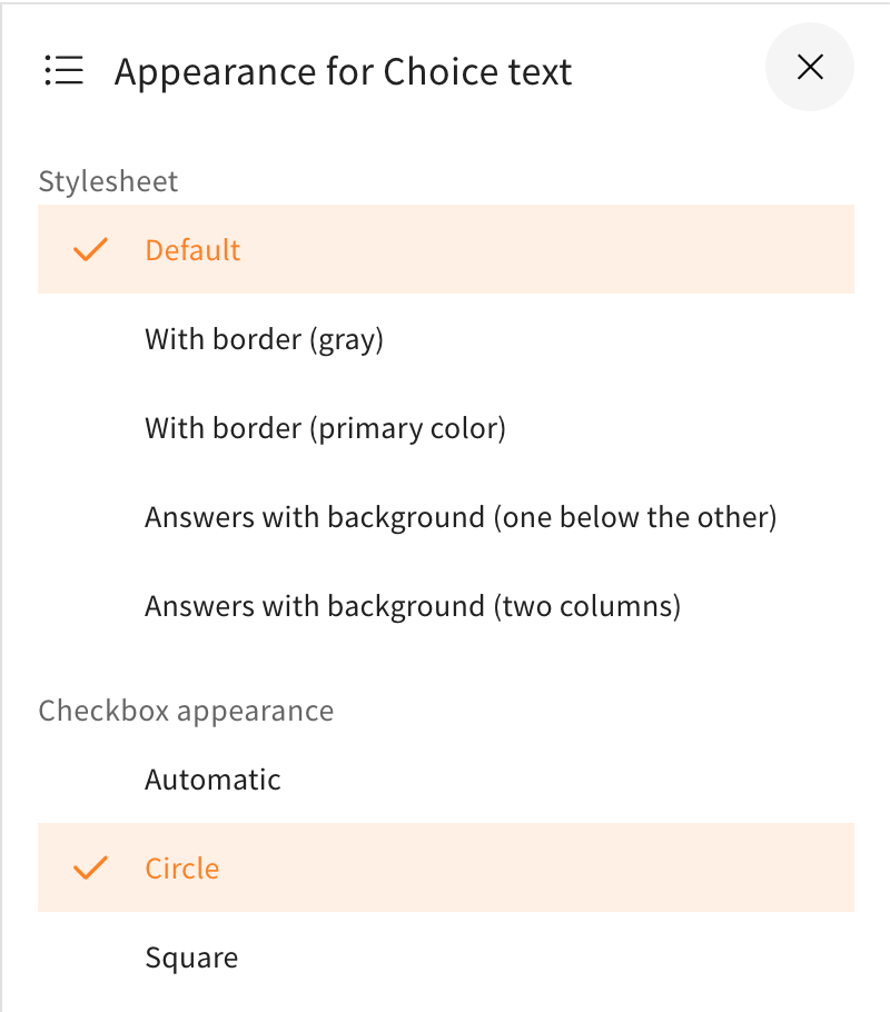
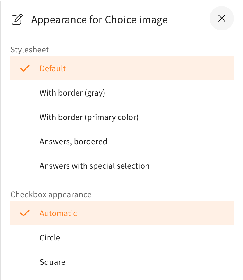
Through a new toggle when editing the appearance of the „Choice text“ and „Choice image“ elements in the „Interactions“ category, you can now manually set the checkboxes in selection quizzes to be square or round. The new feature works the same for online trainings and tests.
This enables both a consistent appearance of choice quizzes as well as the possibility to design them for learners so that they can no longer recognize through the appearance of the checkboxes whether one answer is correct or multiple. Previously, learners could recognize from a circle checkbox that one answer in the choice quiz is correct and from a square checkbox that multiple answers are correct. Authors can thus deliberately decide whether to support learners with this visual hint or not.
You can change the appearance as usual via the green magic wand at the edge of the element in editing mode or in a test under „Edit Test“ for individual questions also via the magic wand, which opens the appearance and task menu.
With the new toggle „Checkbox Appearance“ you can now choose between three options for their appearance. The three selectable options are „Automatic“, „Circle“, and „Square“. You can find these in the side menu for appearance in Choice Test and Choice Quiz directly under the stylesheets.


By default, „Automatic“ is set, which was also set this way before the new feature. This means that in a quiz where only one answer is correct, the checkbox is round and in a selection quiz where multiple answers are correct, it is square.
Thanks to the new toggle, you can now select the appearance of the checkbox as needed for the respective element. It can be used, for example, to make the learning card look more consistent. Like in the pictures below, where on the left the design differentiates but is set like this to automatically appear as a circle for a single right answer and a square for multiple. Below on the right, the option was chosen to change the design for multiple correct answers to be a circle as well.


In combination with the individual instruction in the element settings, you can use it to not directly indicate to learners how many answers are correct. This way, there can be neither the hint under the question that says something like „Select the correct option. Exactly one answer is correct“ nor the hint about how the checkboxes of the answer options look.
Be aware that the change of the appearance from the automatically applied one could be confusing to learners if multiple answers are correct but the checkboxes appear as circles, since it would go against the established standard of radio buttons which are usually set that way and are often clear indicators for one choice being correct. As opposed to the option with the square checkboxes like in the example, which could leave open the possibility of multiple answers being right while hiding the fact that only one is.